If you make a Venn diagram of my history nerdery and my design nerdery, you’ll find dazzle camouflage right in the center. Dazzle camouflage is a very cool real thing that came out of World War I–a ship camouflage that looks like crazy modern art.
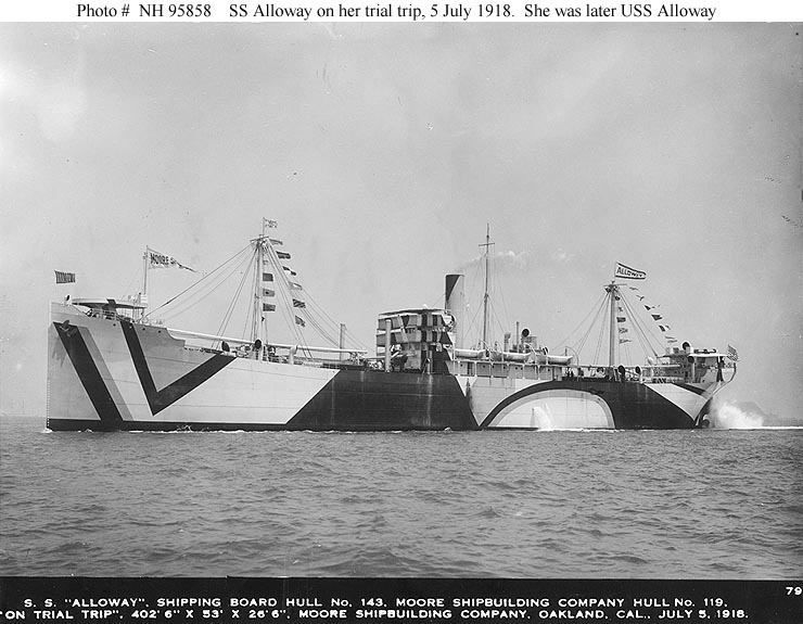
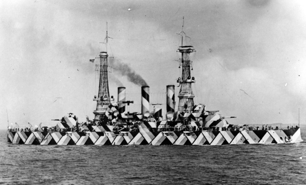
The Allies (mainly Britain and the US) bedazzled thousands of ships. The designs were created by fine artists on both sides of the Atlantic (the US Navy at one point had a Dazzle Department staffed by painters and designers.)
I love dazzle both for the inherent design badassery of the patterns, but also for the medium. They painted giant merchant ships, ocean liners, even battleships in dazzle camouflage. Another thing I love about dazzle is the camoufleurs (camouflage designers) often used the most unlikely colors. Most images of dazzle are black and white, because mostly what remains is (b&w) photographic evidence. But if you look at original design schematics, ship models, or paintings from the period, you’ll see that many of the ships were painted in bright colors: pinks, blues, yellows, greens. What’s not to love about a pink battleship?
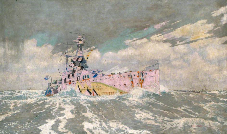
If you’re wondering WHY—dazzle was devised to confuse the aim of German submariners. The dazzle patterns were very carefully designed to obscure a ship’s shape, direction, and speed. Submarine crews needed this information to accurately aim a torpedo, so any confusion could foil their attack. According to studies made at the time, the technique did indeed protect Allied ships (though postwar analysis is a little muddier.)
But who cares! Just look at these things!

[…] wearable rather than framed and on your wall. So I am launching with a line of tote bags that are inspired by my dazzle camouflage obsession. I am very excited about these bags. They are beautiful. They look like modern art. But they are […]
LikeLike
[…] a colorful, distinctly unsubtle camouflage scheme used on Allied shipping in World War I (I explain dazzle in detail here. Or you can scroll down for the TL;DR […]
LikeLike