Back in October 2017 I began an endeavor to start an apparel design business. Nine months later, Standard Rainbow is live. This week I am prepping for the Orcas Island Farmer’s Market, where I will be vending under the Standard Rainbow banner. Today I want to talk about the origin of the brand name and logo.
The name was based on an early brainstorm last winter. I am a lifelong polynerd, and one of my interests is the history of branding. I love the idea of a company with a century-old backstory. What if my project traced back to the early 1900s, or late 1800s? Wiki research pointed me to early examples of companies and corporations. The British East India Company (1600), Royal Dutch Shell (1907), Standard Oil (1870), Bell Telephone Company (1877). I like the quaint directness early branding. Puffy, very general descriptors like National, New York, American, U.S., Standard. Followed by a basic thing: Factory, Steel, Gas, Telegraph. Followed by: Company, Corporation, Limited.

Pacific Coast Oil Co., later Standard Oil, and then Chevron.
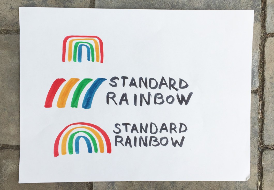
I coupled this historical nerdery with my passion for color, diversity, expression. Pretty early on I focused on the rainbow as a symbol.
I came up with Standard Rainbow in December. But then I dismissed it as too nerdy, too much of an in-joke, too…me. What followed was 5 months of brainstorming and agonizing over other names. My finalists included: Studio Chickaree, Studio Willoughby, Derring Design, and Standard Rainbow. As I approached my self-imposed branding deadline, I still couldn’t decide. So I polled my friends, and the frontrunner was: Standard Rainbow. I guess I should have gone with my gut.
After months of brainstorming, the branding came together in just a couple weeks. For the branding, I turned to my love of design history. One of my favorite graphic design eras is the height of modernism—late 60s to early 80s. I looked at Olympic logos from the 60s, 70s, and 80s (the Best!)
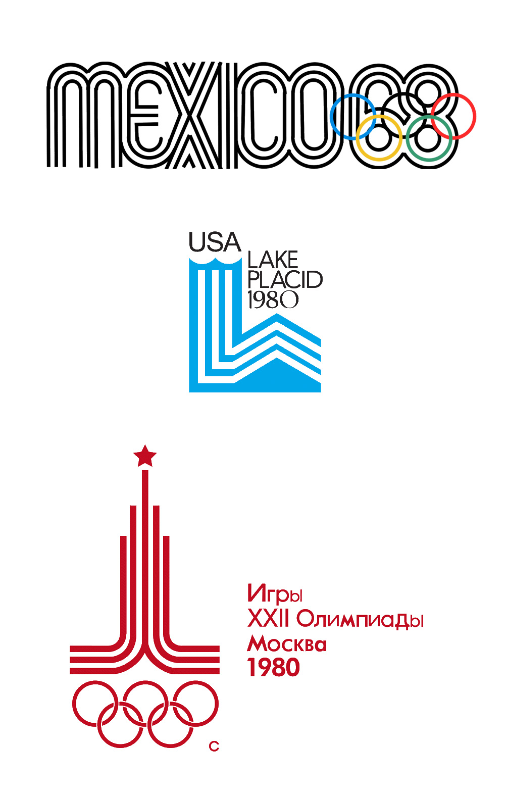
Also the work of Saul Bass (think AT&T, United Airlines, Quaker Oats.)

And finally, the original Apple logo, which I greatly mourned when it was replaced with the monochrome version in the late 90s. Fun fact, the colors in the Apple logo are not in the correct order (vs. a rainbow). This was part of my inspiration for my simplified 4-color rainbow.
![]()
Another consideration was the dye sublimation printing I use for my products. Some colors do not print well on all fabrics—particularly yellows and lighter tones. Hence the mid tone red, orange, green, and blue of the final logo.


I’ll close with a confession. I have long dreamed of having a car with a commercial or “official” livery (think ambulance, maintenance truck.) To know this about me is to know the depths of my nerd soul.
[…]
So, once I settled on a logo, I ordered a pair of magnetic vehicle signs. Right before I clicked “purchase,” I had a pang of doubt. Was this a waste of 50 bucks? But when they arrived, I knew I had made the right decision. For the future: A Standard Rainbow van with full graphics inspired by Dutch ambulances.

Evan Wagoner-Lynch is sponsored by Standard Rainbow
